


Connecting Concepts
Use Science Graphics
John Snow made a map similar to the one below to help him determine the source of the cholera outbreak in London. The dots represent the locations of people who died of cholera. The Xs represent pumps. Use the map to answer questions 31 and 32.
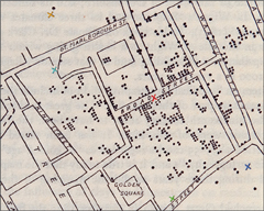
Infer Which pump do you think Snow determined was most likely the source of the cholera outbreak? Explain.
Apply Concepts Do you think a map such as this one could be used to discover the source of a food poisoning outbreak? Explain.
Write About Science
Explanation The ability of bacteria to resist antibiotics has become an increasing public health problem. This problem is due to the overuse and misuse of antibiotics. Suppose that one of your friends always takes antibiotics when he or she is sick. Write a letter to your friend explaining the problem of antibiotic resistance.
Assess the
 Explain how the germ theory of disease led people to develop very simple methods that could prevent the transmission of many diseases.
Analyzing Data
The graph shows the number of cases of the viral disease, polio, in the world from 1980 until 2004. It also shows the percentage of the world's population that was vaccinated for the disease.
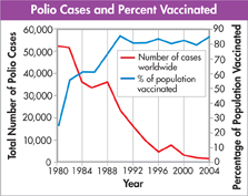
Interpret Graphs During which of the following time periods was there the greatest drop in the number of polio cases around the world?
between 1980 and 1982
between 1984 and 1988
between 1988 and 1996
between 1996 and 2004
Draw Conclusions Which of the following is the most reasonable conclusion to draw from the data shown in the graph?
As the number of people vaccinated increases, the number of polio cases stays constant.
As the number of people vaccinated increases, the number of polio cases has increased.
As the number of people vaccinated increases, the number of polio cases has decreased.
Polio has been eliminated as a disease, and vaccination is no longer necessary.
Table of Contents
- Formulas and Equations
- Applying Formulas and Equations
- Mean, Median, and Mode
- Estimation
- Using Measurements in Calculations
- Effects of Measurement Errors
- Accuracy
- Precision
- Comparing Accuracy and Precision
- Significant Figures
- Calculating With Significant Figures
- Scientific Notation
- Calculating With Scientific Notation
- Dimensional Analysis
- Applying Dimensional Analysis