


Appendix A Science Skills
Data Tables and Graphs
How can you make sense of the data from a science experiment? The first step is to organize the data. You can organize data in data tables and graphs to help you interpret them.
Data Tables
You have gathered your materials and set up your experiment. But before you start, you need to plan a way to record what happens during the experiment. By creating a data table, you can record your observations and measurements in an orderly way.
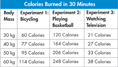
Suppose, for example, that a scientist conducted an experiment to find out how many kilocalories people of different body masses burned while performing various activities for 30 minutes. The data table below shows the results.
Notice in this data table that the independent variable (body mass) is the heading of the first column. The dependent variable (for Experiment 1, the number of kilocalories burned while bicycling for 30 minutes) is the heading of the next column. Additional columns were added for related experiments.
Bar Graphs
A bar graph is useful for comparing data from two or more distinct categories. In this example, pancreatic secretions in the small intestine are shown.
To create a bar graph, follow these steps.
On graph paper, draw a horizontal, or x-axis, and a vertical, or y-axis.
Write the names of the categories (the independent variable) along one axis, usually the horizontal axis. You may put the categories on the vertical axis if that graph shape better fits on your page. Label the axis.
Label the other axis with the name of the depen dent variable and the unit of measurement. Then, create a scale along that axis by marking off equally spaced numbers that cover the range of the data values.
For each category, draw a solid bar at the appropriate value. Then, fill in the space from the bar to the axis representing the independent variable. Make all the bars the same width.
Add a title that describes the graph.
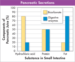
Table of Contents
- Formulas and Equations
- Applying Formulas and Equations
- Mean, Median, and Mode
- Estimation
- Using Measurements in Calculations
- Effects of Measurement Errors
- Accuracy
- Precision
- Comparing Accuracy and Precision
- Significant Figures
- Calculating With Significant Figures
- Scientific Notation
- Calculating With Scientific Notation
- Dimensional Analysis
- Applying Dimensional Analysis