


Circle Graphs
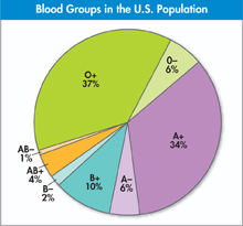
Circle graphs, or pie charts, display data as parts of a whole. Like bar graphs, circle graphs can be used to display data that fall into separate categories. Unlike bar graphs, however, circle graphs can only be used when you have data for all the categories that make up a given group. The circle, or “pie,” represents 100 percent of a group, while the sectors, or slices, represent the percentages of each category that make up that group. The example below compares the different blood groups found in the U.S. population.
To construct a circle graph, follow these steps.
Draw a circle and mark the center. Then, draw a radius line from the center to the circle's edge.
Determine the size of a sector of the graph by calculating the number of degrees that correspond to a percentage you wish to represent. For example, in the graph shown, B+ makes up 10 percent of all blood groups; 360 degrees × 0.10 = 36 degrees.
With a protractor fixed at the center of the circle, measure the angle—in this example, 36 degrees—from the existing radius, and draw a second radius at that point. Label the sector with its category and the percentage of the whole it represents. Repeat for each of the other categories, measuring each sector from the previous radius so the sectors don't overlap.
For easier reading, shade each sector differently.
Add a title that describes the graph.
Reading Diagrams
In scientific figures showing a cut-away of a structure, the diagram or photograph is showing the structure from a particular angle. Look for clues throughout this book that will help you interpret the view being shown.
Cross Sections
A cross section shows a horizontal cut through the middle of a structure. This icon will help you locate cross sections.

Longitudinal Sections
A longitudinal section shows a vertical cut through the middle of a structure. This icon will help you locate longitudinal sections.
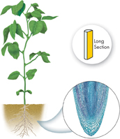
Table of Contents
- Formulas and Equations
- Applying Formulas and Equations
- Mean, Median, and Mode
- Estimation
- Using Measurements in Calculations
- Effects of Measurement Errors
- Accuracy
- Precision
- Comparing Accuracy and Precision
- Significant Figures
- Calculating With Significant Figures
- Scientific Notation
- Calculating With Scientific Notation
- Dimensional Analysis
- Applying Dimensional Analysis