


Line Graphs
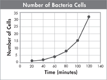
A line graph is used to display data that show how the dependent variable changes in response to manipulations of the independent variable. You can use a line graph when your independent variable is continuous, that is, when there are other points between the ones that you tested. For example, the graph below shows how the growth of a bacterial population is related to time. The graph shows that the number of bacteria approximately doubles every 20 minutes. Line graphs are powerful tools because they also allow you to estimate values for conditions that you did not test in the experiment.
To construct a line graph, follow these steps.
On graph paper, draw a horizontal, or x-axis, and a vertical, or y-axis.
Label the horizontal axis with the name of the independent variable. Label the vertical axis with the name of the dependent variable. Include the units of measurement on both axes.
Create a scale on each axis by marking off equally spaced numbers that cover the range of the data values collected.
Plot a point on the graph for each data value. To do this, follow an imaginary vertical line extending up from the horizontal axis for an independent variable value. Then, follow an imaginary horizontal line extending across from the vertical axis at the value of the associated dependent variable. Plot a point where the two lines intersect. Repeat until all your data values are plotted.
Connect the plotted points with a solid line. Not all graphs are linear, so you may discover that it is more appropriate to draw a curve to connect the points.
The data in the graph at the left fit neatly on a smooth curve. But if you were to connect each data point on the graph below, you would have a mess that yielded little useful information. In some cases, it may be most useful to draw a line that shows the general trend of the plotted points. This type of line is often called a line of best fit. Such a line runs as closely as possible to all the points and allows you to make generalizations or predictions based on the data. Some points will fall above or below a line of best fit.
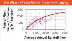
Table of Contents
- Formulas and Equations
- Applying Formulas and Equations
- Mean, Median, and Mode
- Estimation
- Using Measurements in Calculations
- Effects of Measurement Errors
- Accuracy
- Precision
- Comparing Accuracy and Precision
- Significant Figures
- Calculating With Significant Figures
- Scientific Notation
- Calculating With Scientific Notation
- Dimensional Analysis
- Applying Dimensional Analysis