


Connecting Concepts
Use Science Graphics
The following graphs show the size of four different populations over a period of time. Use the graphs to answer questions 30–32.
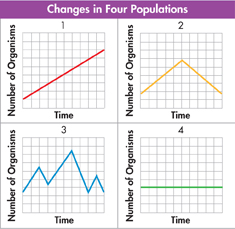
Analyze Data Write a sentence summarizing what each graph shows.
Interpret Graphs Before any of the graphs could be used to make direct comparisons among the populations, what additional information would be necessary?
Compare and Contrast Graphs of completely different events can have the same appearance. Select one of the graphs and explain how the shape of the graph could apply to a different set of events.
Write About Science
Explanation Suppose you have a pet cat and want to determine which type of cat food it prefers. Write an explanation of how you could use scientific methodology to determine the answer. (Hint: Before you start writing, list the steps you might take, and then arrange them in order beginning with the first step.)
Assess the
 Many people add fertilizer to their house and garden plants. Make a hypothesis about whether you think fertilizers really help plants grow. Next, design an experiment to test your hypothesis. Include in your plan what variable you will test and what variables you will control.
Analyzing Data
A researcher studied two groups of fruit flies: Population A was kept in a 0.5 L container; Population B was kept in a 1 L container.
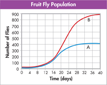
Interpret Graphs The independent variable in the controlled experiment was the
number of flies.
number of groups studied.
number of days.
size of the containers.
Infer Which of the following is a logical inference based on the content of the graph?
The flies in Group B were healthier than those in Group A.
A fly population with more available space will grow larger than a population with less space.
If Group B was observed for 40 more days, the size of the population would double.
In 40 more days, the size of both populations would decrease at the same rate.
Table of Contents
- Formulas and Equations
- Applying Formulas and Equations
- Mean, Median, and Mode
- Estimation
- Using Measurements in Calculations
- Effects of Measurement Errors
- Accuracy
- Precision
- Comparing Accuracy and Precision
- Significant Figures
- Calculating With Significant Figures
- Scientific Notation
- Calculating With Scientific Notation
- Dimensional Analysis
- Applying Dimensional Analysis