1.4 Presenting Scientific Data
Reading Focus
Key Concepts
 How do scientists organize data?
- How can scientists communicate experimental data?
Vocabulary
slope
direct proportion
inverse proportion
Reading Strategy
Comparing and Contrasting After you read this section, compare types of graphs by completing the table below.
Type of Graph |
Description |
Used For |
|---|---|---|
Line |
a. |
b. |
Bar |
c. |
d. |
Circle |
e. |
f. |

Much of the information you get every day comes from the news media. Newspapers, television, radio, and the Internet let you access a wealth of information about events going on in the world. But in order for news to be useful, it must be communicated. If a news reporter witnesses an event but doesn't report it, then he might as well not have seen it. If the event is reported, then it must be described in a clear, organized manner for it to be understood and appreciated. Like the news, scientific data become meaningful only when they are organized and communicated.
Organizing Data
Scientists accumulate vast amounts of data by observing events and making measurements. Interpreting these data can be a difficult task if they are not organized. Scientists can organize their data by using data tables and graphs. These tools make it easier to spot patterns or trends in the data that can support or disprove a hypothesis.
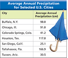
Data Tables
The simplest way to organize data is to present them in a table. Figure 20 is a data table that shows the average annual precipitation for seven U.S. cities. The table relates two variables—a manipulated variable (location) and a responding variable (average annual precipitation).