Data Tables
Data tables help to organize data and make it easier to see patterns in data. If you plan data tables before doing an experiment, they will help you record observations in an orderly fashion.
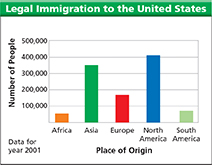
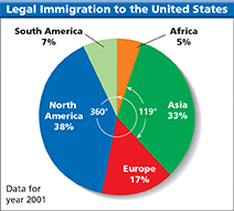
The data table below shows United States immigration data for the year 2001. Always include units of measurement so people can understand the data.
Place of Origin |
Number of Legal Immigrants |
|---|---|
Africa |
53,948 |
Asia |
349,776 |
Europe |
175,371 |
North America |
407,888 |
South America |
68,888 |
Bar Graphs
To make a bar graph, begin by placing category labels along the bottom axis. Add an overall label for the axis Place of Origin. Decide on a scale for the vertical axis. An appropriate scale for the data in the table is 0 to 500,000. Label the vertical axis Number of People. For each continent, draw a bar whose height corresponds to the number of immigrants. You will need to round off the values. For example, the bar for Africa should correspond to 54,000 people. Add a graph title to make it clear what the graph shows.
Circle Graphs
Use the total number to calculate percentages. For example, the percentage of immigrants from Africa in 2001 was . Multiply each percent by 360° to find the central angle of each wedge. For Africa, the central angle is 18°. Use a protractor to draw each central angle. Color and label the wedges and finish your graph with a title.
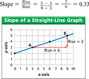
Line Graphs
The slope of a straight-line graph equals the “rise over the run.” The rise is the change in the y values and the run is the change in the x values. Using points A and B on the graph below gives